A n d y W a r h o l A n n e x
STREET VIEW
ANDY WARHOL
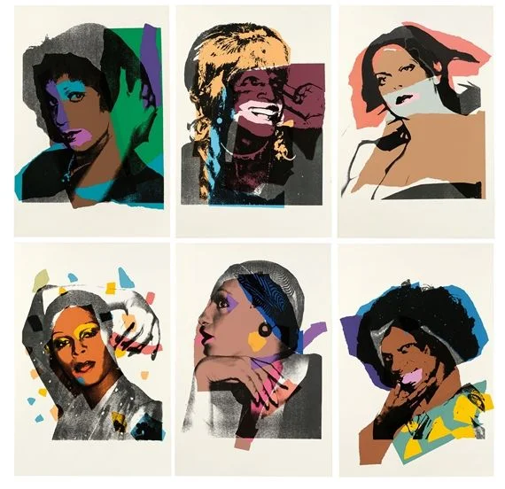
Andy Warhol ( Andrew Warhola; August 6, 1928 – February 22, 1987) was an American artist of the 20th Century, creative director and producer who was a leading figure visual art movement: pop art. His works explore the relationship between artistic expression of, pop culture, and cosummerism that flourished by the 1960s, and span a variety of media, including painting, silkscreening, photography, film, and sculpture. Some of his best known works include the silkscreen paintings Campbell's Soup Cans (1962) and Marilyn Diptych (1962), the experimental film Chelsea Girls (1966), and the multimedia events known as the Exploding Plastic Inevitable (1966–67).
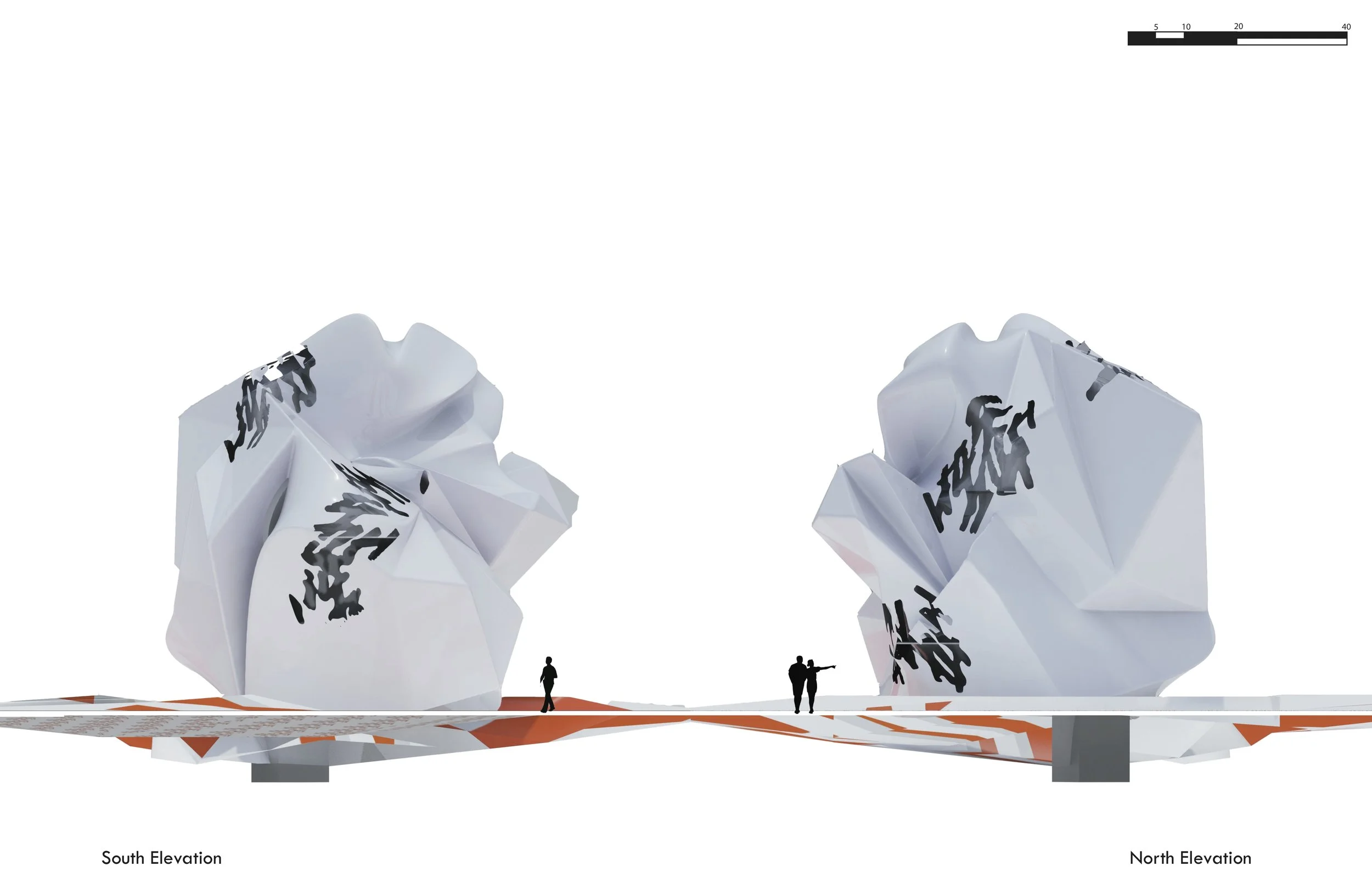
The contrast between sharp and soft masses sparked the idea that created the de- familiarized massing of the structure that was originally inspired by a traffic cone. Andy Warhol had a theme in his self-portraits that illustrated the coexistence of opposites that occupy the same being and/or form. The instability of this composition re-articulated the original properties of the traffic cone’s form, skin, and posture.
The form and skin of the new object is articulated by the additive sharp edges on the soft surface that represents the cone’s material properties. The ground design pattern goes against the structure's geometry and visually displays a safety cone shattered like glass, projecting the conecpt of material instability in the built enviorment.


